• Skip to primary navigation
  • Skip to main content
  • Skip to footer
  • Skip to footer navigation
  • +1-(310)-614-2969
  • [email protected]
  • Facebook
  • Instagram
  • LinkedIn
  • Twitter

Sara Shuman

  • Experience
  • Clients
  • Portfolio
  • Blog
  • Contact

Accessibility Matters – SAP’s home page banner image fail

September 4, 2020 by Sara Shuman

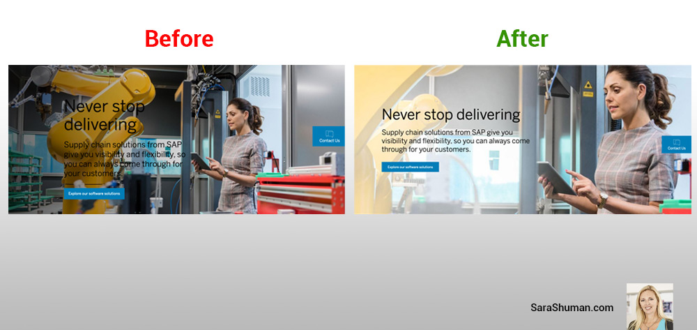
Color contrast is a common web accessibility issue that is often overlooked. Luckily, SAP quickly fixed the error.

People who may have low vision, or maybe colorblind, typically encounter some difficulty distinguishing text from a background color if the contrast is insufficient. There are nearly three times more individuals with low vision than those with total blindness; and one out of twelve people has some sort of color deficiency. So, it is critical to consider adequate contrast between text and background.

Here is a helpful color contrast tool that confirms the used hex color difference and brightness pass readability accessibility ratios.

Take a look at the before and after example of SAP’s banner image:


Footer

About Sara

Sara is a plug-and-play digital experience creative director available for freelance or and FTE role.

Contact

Address: Southern California, Los Angeles
Phone: +1-(310)-614-2969
Email: [email protected]

  • Facebook
  • Instagram
  • LinkedIn
  • Twitter

Fun Fact

Sara is originally from the Virgin Islands and can hold a meeting using a down-islander accent.

Copyright © 2023 · Kreativ Pro on Genesis Framework · WordPress · Log in

  • Experience
  • Clients
  • Portfolio
  • Contact