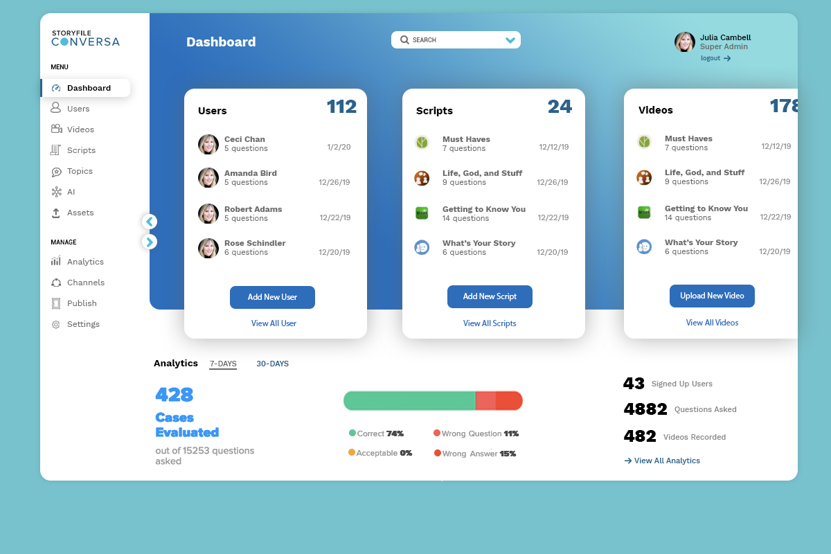
Dashboards should only display relevant information.
We call them dashboards because, just like in a car, they’re meant to show us critically, pertinent data at a glance. We don’t expect a car dashboard to display information about the news, local places of interest or upcoming appointments because however interesting this information is, it’s not relevant. Dashboards must always save the user time and help the user to be more efficient. A best practice is to surface enough relevant information to be helpful on dashboards, but not too much to create any cognitive dissonance. Simple, but informative, is better.
-
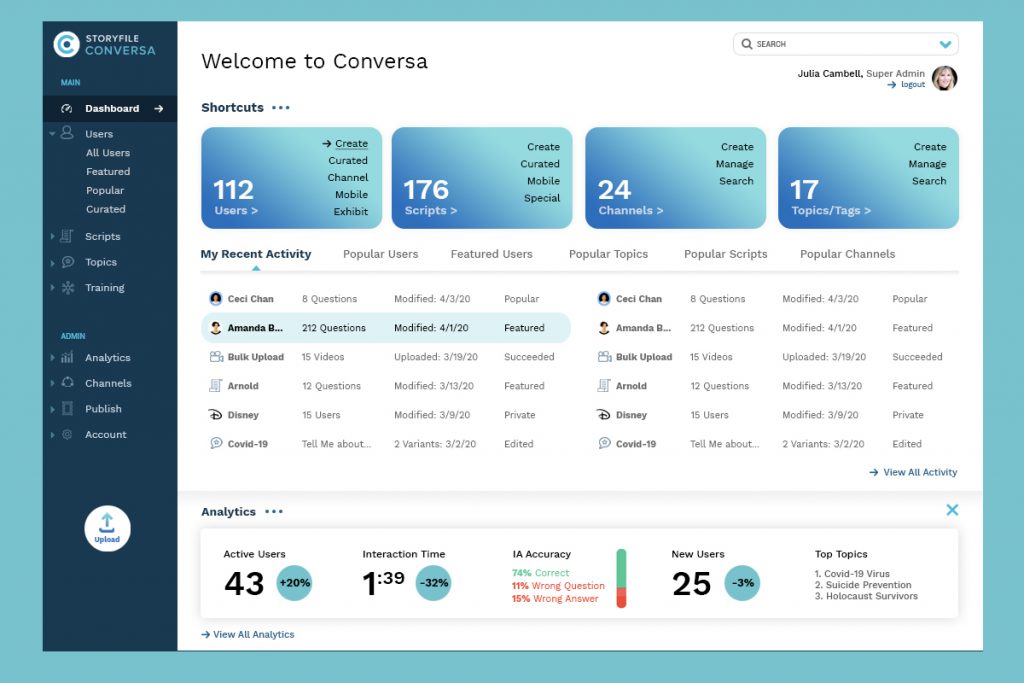
- OPTION 1 – Dashboard designed for mobile application content management system (designed by Sara Shuman).

-
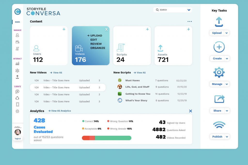
- OPTION 2 – Alternative simplified navigational design (designed by Sara Shuman).

-

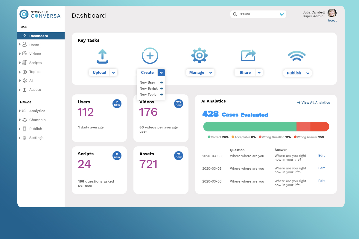
- OPTION 3 – Simple Dashboard Design (designed by Sara Shuman).
-
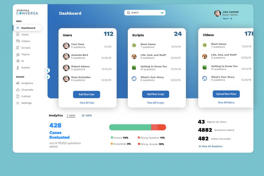
- OPTION 4 – Carousel Dashboard Design (designed by Sara Shuman).
-

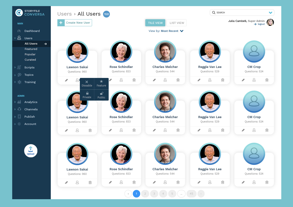
- User Detail Screen (designed by Sara Shuman).
-
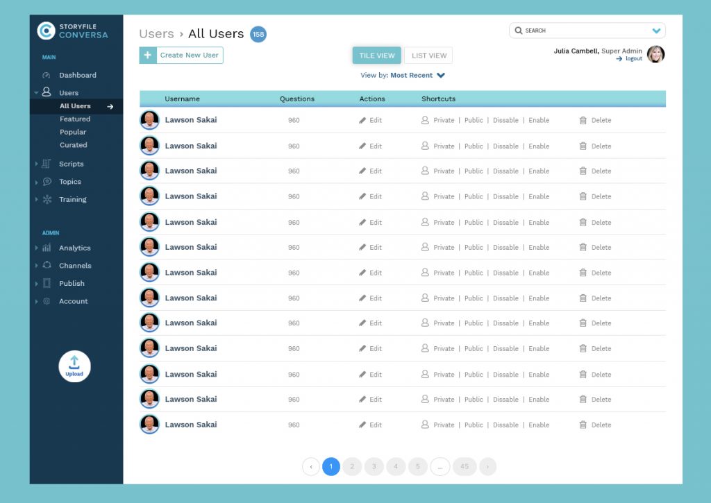
- User List View Screen (designed by Sara Shuman).
