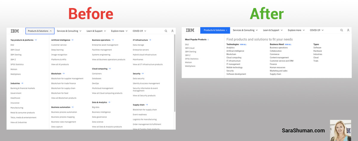
Put IBM’s main menu navigation on a diet–stat.
Whenever a website’s main menu has a scroll bar inside, it’s essentially broken. Or, if the main menu fills-up the entire screen, it’s adding a huge cognitive load on the user. But that doesn’t mean the UX/UI design team initially built it that way. Sometimes a collision of form and functionality can occur. First, the content team fills-up their nifty new design UI element and breaks it by adding too much content. Then, a quick fix is suggested by the tech team to add a scroll bar inside that element. But that doesn’t ultimately fix the user experience, as the navigation is still a full-screen wall of links. Not a great experience for someone to try and (easily) find what they’re looking for.
Take a look at the before and proposed after example of IBM’s menu – it’s 50% the height of the current menu, while re-architecting a similar list of links within the navigation:
