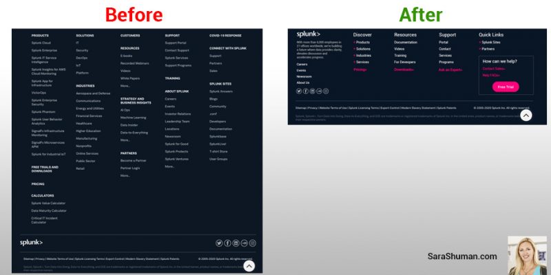
Splunk’s ginormous fat footer re-imagined for quick scanability. When fat footers end-up being similar to our junk drawers (ahem, I have some too), the link collection can be so big that it is impossible for your visitors to scan quickly. An overstuffed footer breaks the whole reason for a fat footer in the first place, […]
Archives for September 2020
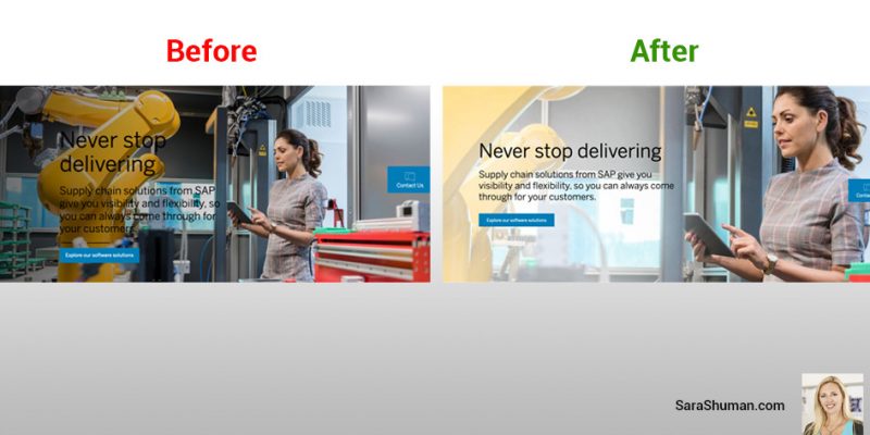
Accessibility Matters – SAP’s home page banner image fail
Color contrast is a common web accessibility issue that is often overlooked. Luckily, SAP quickly fixed the error. People who may have low vision, or maybe colorblind, typically encounter some difficulty distinguishing text from a background color if the contrast is insufficient. There are nearly three times more individuals with low vision than those with […]
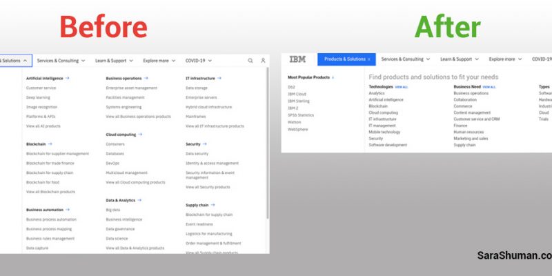
The Power of UX Simplicity–IBM’s main menu reimagined
Put IBM’s main menu navigation on a diet–stat. Whenever a website’s main menu has a scroll bar inside, it’s essentially broken. Or, if the main menu fills-up the entire screen, it’s adding a huge cognitive load on the user. But that doesn’t mean the UX/UI design team initially built it that way. Sometimes a collision […]